
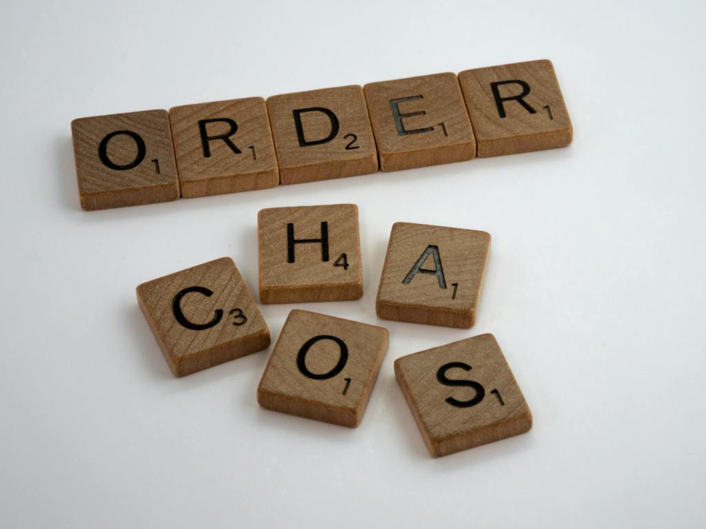

Have you ever looked at a document’s design and felt overwhelmed by the amount of information? Or maybe you couldn’t find important information on a flyer you received? These are both examples of design failing to establish a clear visual hierarchy in documents.
Visual hierarchy is the foundation of your document layout. It’s how you arrange elements to guide the viewer’s eye to the most important information. Good visual hierarchy results in a more user-friendly and impactful design.
Why is Visual Hierarchy Important?
People have limited attention spans and are constantly being bombarded with lots of information. It’s important that designs allow the viewer to quickly grasp the main idea as quickly as possible. Visual hierarchy helps achieve this by:
- Improving Clarity and Communication: A well-organized design ensures the message is clear and understood by everyone.
- Enhancing User Experience: By guiding viewers through the design, visual hierarchy makes it easier to find the information they’re looking for.
- Boosting Engagement: A clear and visually appealing design keeps viewers interested and encourages them to explore further.
Creating Visual Hierarchy: Tools of the Trade
Designers have a toolbox filled with techniques to establish visual hierarchy. Here are some of the most common ones:
- Size: Our eyes are naturally drawn to larger elements. Use larger fonts and imagery for the most important information.
- Color: Certain colors grab attention more than others. Use bright or contrasting colors to highlight key elements.
- Contrast: Playing with light and dark elements creates visual interest and emphasizes important information.
- Negative Space: The empty space around elements can be just as important as the elements themselves. Use negative space to isolate and draw attention to key visuals.
- Alignment and Proximity: Grouping related elements and aligning them creates a sense of order and guides the eye through the design.
- Typography: Font size, weight, and style all contribute to visual hierarchy. Use bold fonts for headlines and more reserved styles for body text.
- Repetition: Establishes consistency, linking styles together. If used strategically, repetition can enhance rhythm and flow, or even contribute to the overall meaning of your design.
- Depth and Dimension: By layering elements so that some appear closer or further away, you can guide the viewer’s eye.
Applying These Principles
The next time you’re creating a design, consider these tips:
- Identify the Most Important Information: What’s the key message you want viewers to take away?
- Prioritize Elements: Rank the design elements based on their importance to the message.
- Apply Visual Hierarchy Techniques: Use size, color, contrast, and other techniques to emphasize the most important elements.
- Test and Refine: Get feedback from others and refine your design to ensure the visual hierarchy is clear and effective.
By mastering visual hierarchy when drafting documentation, you can create clear, engaging, and impactful designs that resonate with your audience. Remember, a well-organized design isn’t just about aesthetics; it’s about guiding viewers on a journey of understanding and engagement.
This blog is authored by @amylloyd, a professional Designer with Kerri A. Salata, Legal Professional Corp. Amy is a multidisciplinary designer with a BFA from NSCAD University. She has experience in print design, motion picture, branding and illustration.
